| Risk Equation widgetThis widget displays a calculated risk value in US dollars, derived from multiplying the likelihood of a security incident by its potential financial impact. It provides a quick, at-a-glance understanding of how probable an event is and what the associated monetary loss might be, helping you prioritize and address the highest-risk areas first. |
.jpg)
| Risk Composition widgetThis widget shows a breakdown of your risk posture across several risk categories—breach impact, inherent risk, post-mitigation risk, and residual risk—represented in monetary terms. It helps you understand how each component changes when mitigation measures are applied, allowing you to identify where additional efforts may be needed. |
.jpg)
| Vulnerabilities List widgetThis widget provides a searchable table of known vulnerabilities, sorted by their maximum exposure score. Each entry displays the vulnerability’s name or identifier and its associated severity metrics, such as CVSS. This view helps you quickly locate and prioritize vulnerabilities that pose the highest risk to your environment. |
.jpg)
| Vulnerability Summary widgetThis widget shows the total count of unique vulnerabilities in your environment and categorizes them by severity level—critical, high, medium, and low. This visualization helps you quickly assess the overall distribution of vulnerabilities, making it easier to understand and prioritize remediation efforts. |
.jpg)
| Security Controls ROI widgetThis widget displays the comparative risk—both in monetary terms and likelihood—before and after implementing security controls. It shows how much risk is reduced, giving you a clear view of the financial impact and effectiveness of those controls. |
.jpg)
| Controls Compliance Instances widgetThis widget displays how many controls have passed or failed compliance across different categories. It provides a quick snapshot of compliance status, helping you pinpoint where attention is needed to maintain or improve overall compliance. |
.jpg)
| Next Best Steps widgetThis widget lists prioritized remediation actions across different stages—Proposed, In Progress, and Completed—along with their estimated risk reduction in monetary terms. It helps you quickly identify and track the tasks that will have the greatest impact on lowering your organization’s overall risk. |
.jpg)
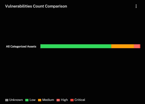
| Vulnerabilities Count Comparison widgetThis widget shows the total number of vulnerabilities for a particular asset group, broken down by severity categories (Unknown, Low, Medium, High, Critical). It helps you quickly identify where the bulk of your high-severity vulnerabilities lie, guiding more focused remediation efforts. |
| Top Vulnerable Items widgetThis widget displays the items or vendors with the greatest number of known vulnerabilities, segmented by severity level (Unknown, Low, Medium, High, Critical). This view helps you identify which items present the highest risk and prioritize your remediation efforts accordingly. |
.jpg)
| Assets with Exposures widgetThis widget displays a list of assets alongside their estimated breach risk in monetary terms. The table includes each asset’s hostname and its associated risk value, helping you quickly identify and prioritize those assets most in need of remediation. |
.jpg)
| Assets with Exposures by Site widgetThis widget lists each site alongside the count of unpatched assets. It provides a quick way to identify which locations have the highest volume of vulnerabilities, guiding you to focus remediation efforts where they’re most needed. |
.jpg)
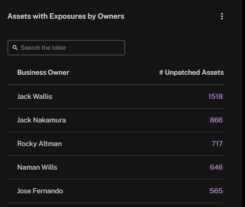
| Assets with Exposures by Owners widgetThis widget lists each owner alongside the count of unpatched assets. It provides a quick way to identify which owners have the highest volume of vulnerabilities, guiding you to focus remediation efforts where they’re most needed. |
| Vulnerabilities Instance Coverage widgetThis widget displays the total count of vulnerabilities identified by different data sources. Each bar shows how many instances come from each source, helping you spot potential gaps or overlaps in detection and ensure comprehensive coverage. |
.jpg)
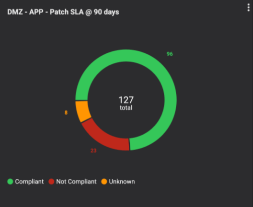
| SLA Compliance: Assets WidgetThe Patch SLA Compliance widget displays the patch status of assets in your environment, categorized by their adherence to defined SLAs. It segments assets into Compliant, Not Compliant, and Unknown groups, allowing you to quickly identify areas that meet patching requirements, those that are overdue, and those that require further investigation. |
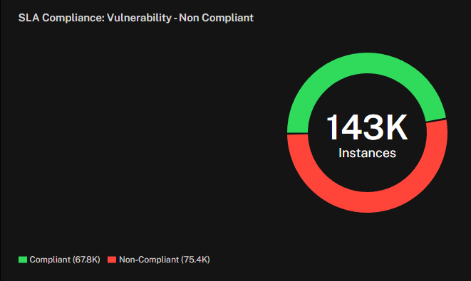
| SLA Compliance: Vulnerabilities WidgetThe SLA Compliance: Vulnerability Widget displays the patch status of vulnerability instances in your environment. It segments vulnerabilities into All Instances, Compliant Instances Only, and Non-Compliant Instances Only. |
| Asset List widgetThis widget displays all discovered assets along with their potential breach impact in monetary terms. It includes each asset’s hostname and its associated risk value, helping you quickly identify assets that could incur the highest cost if compromised. |
.jpg)
| Assets by Site widgetThis widget shows each site alongside the total number of assets located there. It helps you quickly identify where your largest asset footprints lie, enabling you to focus your security and remediation efforts on the most critical locations. |
.jpg)
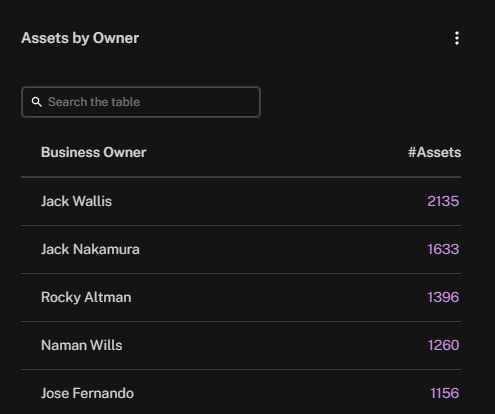
| Assets by Owner widgetThis widget shows each owner alongside the total number of assets assigned. It helps you quickly identify who owns the assets, enabling you to focus your security and remediation efforts on the most critical owners. |
| Asset Coverage widgetThis widget compares the number of assets identified by different data sources, helping you spot potential coverage gaps and confirm you have a comprehensive view of all your assets. |
.jpg)
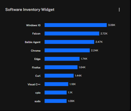
| Software Inventory widgetThis widget displays the top installed software packages, sorted by the total number of instances discovered in your environment. It helps you identify where the greatest usage lies, so you can track patch levels and potential vulnerabilities more effectively. |
| Data Source Telemetry widgetThis widget displays the top data sources contributing telemetry, along with the number of devices or assets each source covers. It helps you identify which sources provide the bulk of your security data, ensuring you maintain comprehensive coverage and spot any potential gaps. |
.jpg)
| Asset Types widgetThis widget shows a breakdown of assets by category—such as desktops/laptops, servers, IoT devices, etc.—alongside their respective counts. It helps you understand the composition of your environment. |
.jpg)
| Power Widget – Bar Chart – Risk Score widgetThis widget displays the risk scores for specific asset categories or groups, using color coding to indicate severity (Low, Medium, High). In this example, both Linux/Unix Servers and Perimeter have a risk score of 89, which is categorized as high, helping you quickly identify and prioritize areas of greatest concern. Note that this widget will show the highest risk score found in the asset category. |
.jpg)
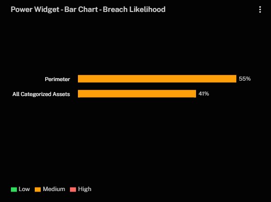
| Power Widget – Bar Chart – Breach Likelihood widgetThis widget displays the likelihood of a breach for specific asset categories or groups, using color coding to indicate severity (Low, Medium, High). This comparison helps you quickly see which areas may be at greater risk of compromise and prioritize accordingly. |
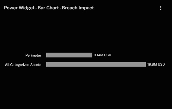
| Power Widget – Bar Chart – Breach Impact widgetThis widget displays the potential financial damage, in US dollars, that could result from a breach across different asset groups, helping you identify where a breach would carry the highest monetary consequences. |
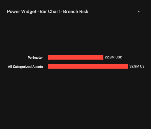
| Power Widget – Bar Chart – Breach Risk widgetThis widget displays the overall breach risk, in US dollars, for each asset group or category. It helps you see where the financial exposure is greatest and focus your remediation efforts accordingly. |
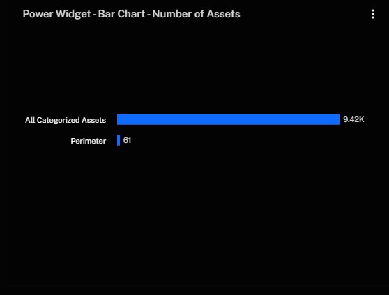
| Power Widget – Bar Chart – Number of Assets widgetThis widget displays the total number of assets for each group or category, allowing you to quickly see how your environment is distributed and where your largest concentrations lie. |
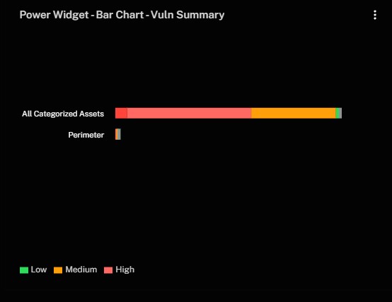
| Power Widget – Bar Chart – Vuln Summary widgetThis widget displays a comparison of vulnerability severities—Low, Medium, and High—across different asset groups. It helps you identify which groups have higher concentrations of critical vulnerabilities and prioritize remediation efforts accordingly. |
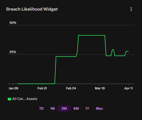
| Power Widget – Trend Chart – Breach Likelihood widgetThis widget displays how breach likelihood evolves over time, letting you track changes in risk posture and spot patterns or spikes that may require further investigation. |
| Power Widget – Trend Chart – Breach Risk widgetThis widget tracks how breach risk (in US dollars) changes over time. It helps you see trends and shifts in potential financial exposure, making it easier to gauge the impact of security improvements or emerging threats. |
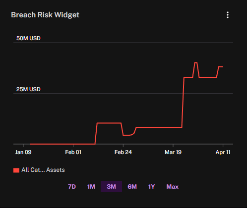
| Power Widget – Trend Chart – Number of Assets widgetThis widget shows how the total count of assets changes over time, helping you track growth or shrinkage in your environment and identify any unusual fluctuations. |
.jpg)
| Power Widget – Trend Chart – Risk Score widgetThis widget shows how the overall risk score changes over time, letting you monitor improvements or deteriorations in your security posture and assess the impact of any new measures or emerging threats. |
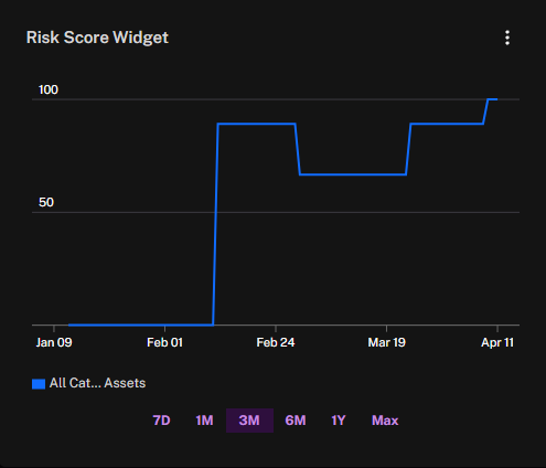
| Power Widget – Trend Chart – MTTP widgetThis widget displays how your mean time to patch (MTTP) changes over time, measuring the average duration between the discovery of a vulnerability and the application of a patch. Monitoring MTTP helps you understand how effectively and efficiently your organization responds to newly identified security issues. If this metric is high, it may indicate bottlenecks in your patching process or insufficient resources. By tracking MTTP over days, weeks, or months, you can evaluate the impact of process improvements or new policies, ensuring that vulnerabilities are addressed more quickly and that your organization’s overall security posture remains strong. |
.jpg)
| Power Widget – Trend Chart – MTTR widgetThis widget tracks how your mean time to remediate (MTTR) changes over time, measuring the average duration between identifying a security issue and fully resolving it. While MTTP focuses on how quickly you deploy a patch after discovering a vulnerability, MTTR covers the entire remediation process, from detection to final closure. Monitoring MTTR helps you understand where delays may occur—such as in testing or validation—and whether your organization is effectively closing out vulnerabilities. By comparing MTTP and MTTR, you gain insight into both the speed of your patching process and the efficiency of your overall remediation workflow. MTTP only tracks the patching process, while MTTR tracks the full process of addressing a security vulnerability—whether through patching or other mitigation techniques. If no patch is available, MTTP is irrelevant, but MTTR is still important. So, while a fast MTTP indicates an efficient patching process, a fast MTTR signals strong overall security posture and incident response. |
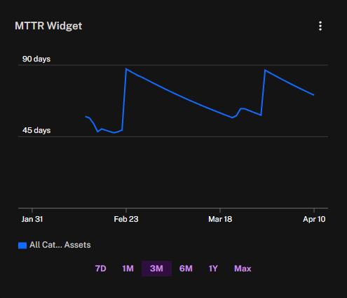
| Power Widget – Trend Chart – MOVA widgetThis widget displays how your mean open vulnerability age (MOVA) changes over time, measuring the average number of days that vulnerabilities remain unaddressed. If MOVA is trending upward, it may indicate that your team is taking longer to remediate newly discovered issues or that resources are stretched thin. Conversely, a downward trend suggests improvements in closing out vulnerabilities more quickly. Monitoring this metric helps you ensure that potential risks don’t linger in your environment, ultimately supporting a more proactive and efficient vulnerability management process. |
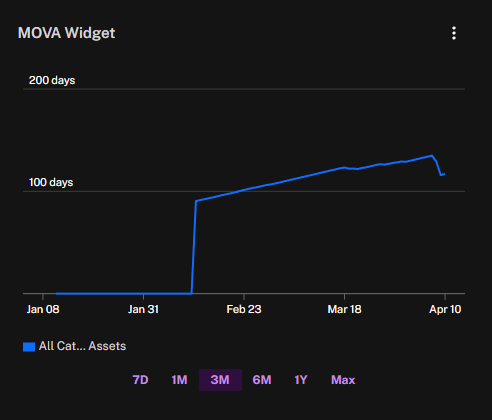
| Power Widget – Donut Chart – Risk Score widgetThis widget displays an overall risk score in a color-coded donut chart, giving you a quick, at-a-glance assessment of your security posture. The center of the donut shows the numerical risk value, and the surrounding segments reflect the severity level—such as Low, Medium, or High—so you can immediately see how serious the threat may be. |
.jpg)
| Power Widget – Donut Chart – Number of Assets widgetThis widget provides a quick overview of how many assets are in your environment, broken down by categories. The total asset count appears in the center, while the donut segments are color-coded to represent each category (e.g., servers, desktops/laptops). This visual breakdown helps you quickly understand the composition of your environment and focus your security measures accordingly. |
.jpg)
| Power Widget – Donut Chart – Breach Likelihood widgetThis widget provides a visual representation of your environment’s likelihood of a breach. A numeric value in the center indicates the overall percentage or score, while the donut segments are color-coded (e.g., Low, Medium, High) to show where you stand on the risk spectrum. This layout allows you to see at a glance how urgent your breach risk may be and to prioritize security efforts accordingly. |
.jpg)
| Power Widget - Histogram - Telemetry ScoreThis widget displays the completeness of security-related data collected for assets, showing whether your visibility is comprehensive or has significant gaps. The distribution helps you quickly identify where monitoring coverage is insufficient, so you can close blind spots and improve overall situational awareness. |
.jpg)
| Power Widget - Histogram - Exposure ScoreThis widget presents the level of exposure of the assets in the selected group. |
.jpg)
| Power Widget - Histogram - Risk ScoreThis widget presents the level of risk score of the assets in the selected group. |
.jpg)
| Power Widget - Histogram - Asset Criticality ScoreThis widget presents the level of asset criticality scores of the assets in the selected group. |
.jpg)
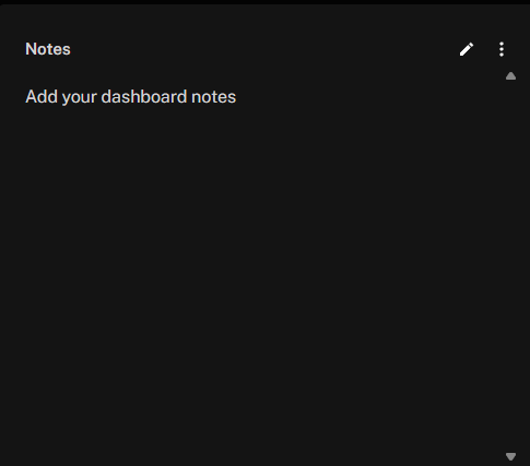
| Power Widget - Dashboard NotesThis widget allows you to add notes to your dashboards. |
See Also: