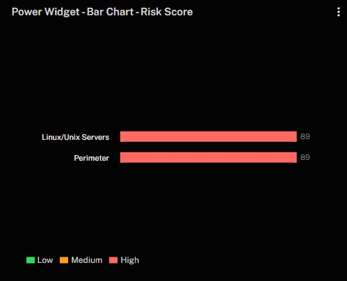
This widget displays the risk scores for specific asset categories or groups, using color coding to indicate severity (Low, Medium, High). In this example, both Linux/Unix Servers and Perimeter have a risk score of 89, which is categorized as high, helping you quickly identify and prioritize areas of greatest concern. Note that this widget will show the highest risk score found in the asset category.
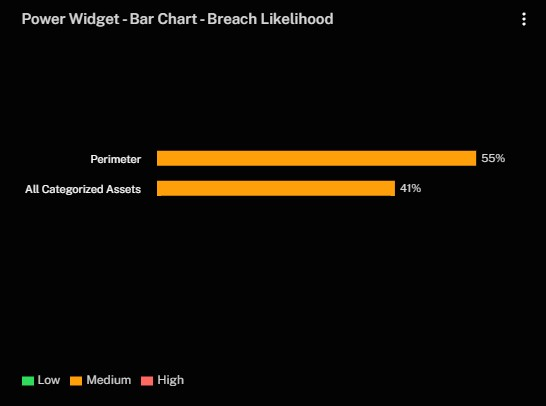
This widget displays the likelihood of a breach for specific asset categories or groups, using color coding to indicate severity (Low, Medium, High). This comparison helps you quickly see which areas may be at greater risk of compromise and prioritize accordingly.
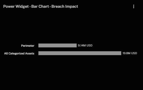
This widget displays the potential financial damage, in US dollars, that could result from a breach across different asset groups, helping you identify where a breach would carry the highest monetary consequences.
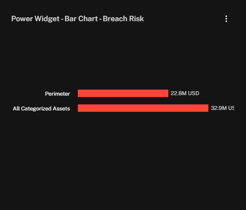
This widget displays the overall breach risk, in US dollars, for each asset group or category. It helps you see where the financial exposure is greatest and focus your remediation efforts accordingly.
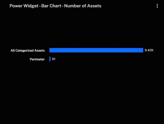
This widget displays the total number of assets for each group or category, allowing you to quickly see how your environment is distributed and where your largest concentrations lie.
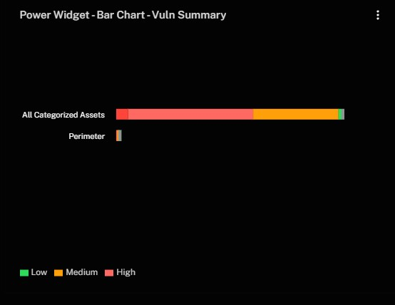
This widget displays a comparison of vulnerability severities—Low, Medium, and High—across different asset groups. It helps you identify which groups have higher concentrations of critical vulnerabilities and prioritize remediation efforts accordingly.
See Also: