ASSETS
Exposure Management (EM)
Vulnerability Inventory
.png)
Comprehensive table listing all CVEs affecting selected asset groups. Provides filtering by severity, CVSS score, patch availability, and exploit status with customizable column views.
Vulnerability Overview
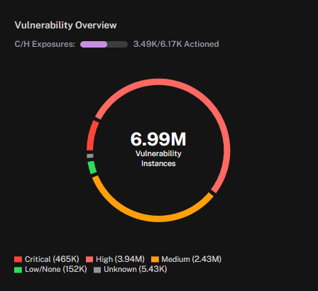
Donut chart summarizing vulnerability distribution by severity level. Shows total count of vulnerabilities or unique CVEs with breakdown by critical, high, medium, and low severities.
Control Effectiveness
.png)
Measures the return on investment and risk reduction achieved by security controls. Quantifies how much risk is mitigated per dollar spent on specific security measures.
Control Implementation Status
.png)
Tracks implementation status of security controls across different frameworks. Shows compliance percentages, failed controls, and remediation requirements.
Vulnerability Comparison
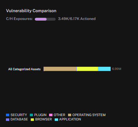
Tracks changes in vulnerability counts over time across different asset groups. Helps identify whether vulnerability management efforts are reducing overall exposure.
Top Vulnerable Items
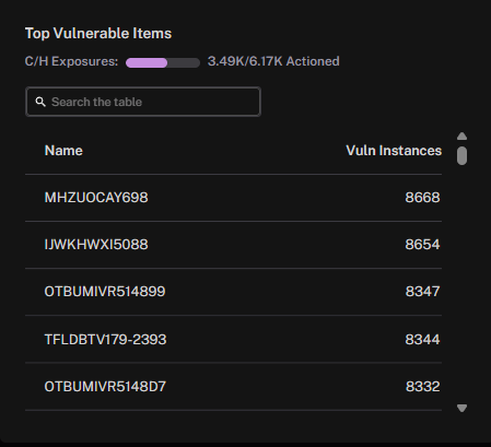
Ranks assets, software products, or vendors by vulnerability count or severity. Identifies which components contribute most to organizational risk for prioritized remediation.
Assets with Exposures
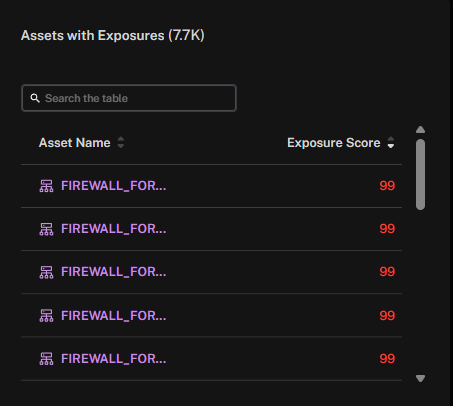
Identifies assets with unpatched vulnerabilities sorted by risk score. Prioritizes which systems need immediate attention based on exposure and criticality.
Assets with Exposures by Site
.png)
Shows count of vulnerable assets at each location or site. Helps identify which sites have the highest concentration of security exposures.
Assets with Exposure by Owner
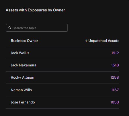
Displays vulnerability exposure levels grouped by responsible teams. Tracks which teams have the most unpatched systems requiring attention.
Vulnerability Instance Coverage
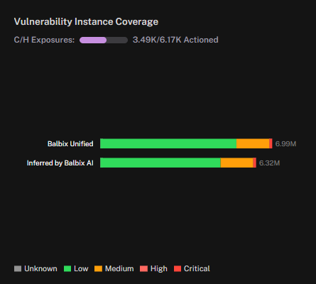
Stacked bar chart showing how vulnerability data is distributed across different scanning tools and data sources. Identifies coverage gaps in vulnerability detection.
SLA Compliance: Assets
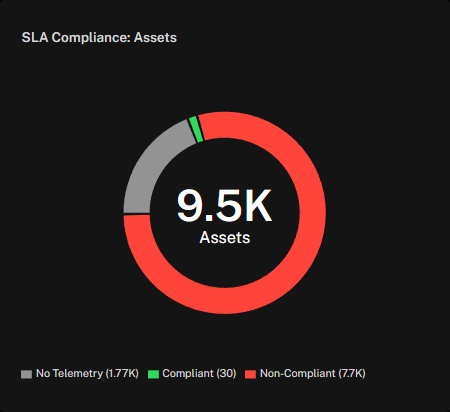
Monitors whether asset patching meets defined service level agreements. Shows percentage of assets patched within required timeframes versus overdue.
SLA Compliance: Vulnerabilities
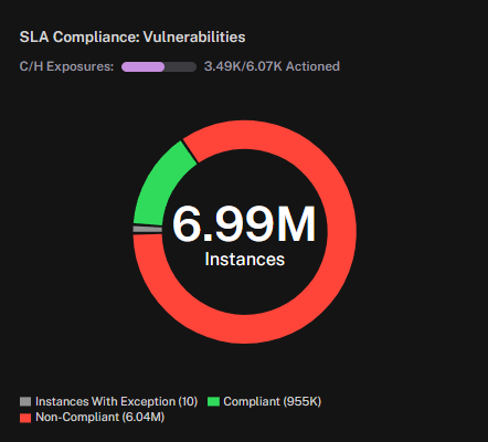
Tracks vulnerability remediation performance against SLA targets for infrastructure assets. Displays on-time remediation rates and identifies SLA violations.
Exposure Assessment (EA)
Asset List
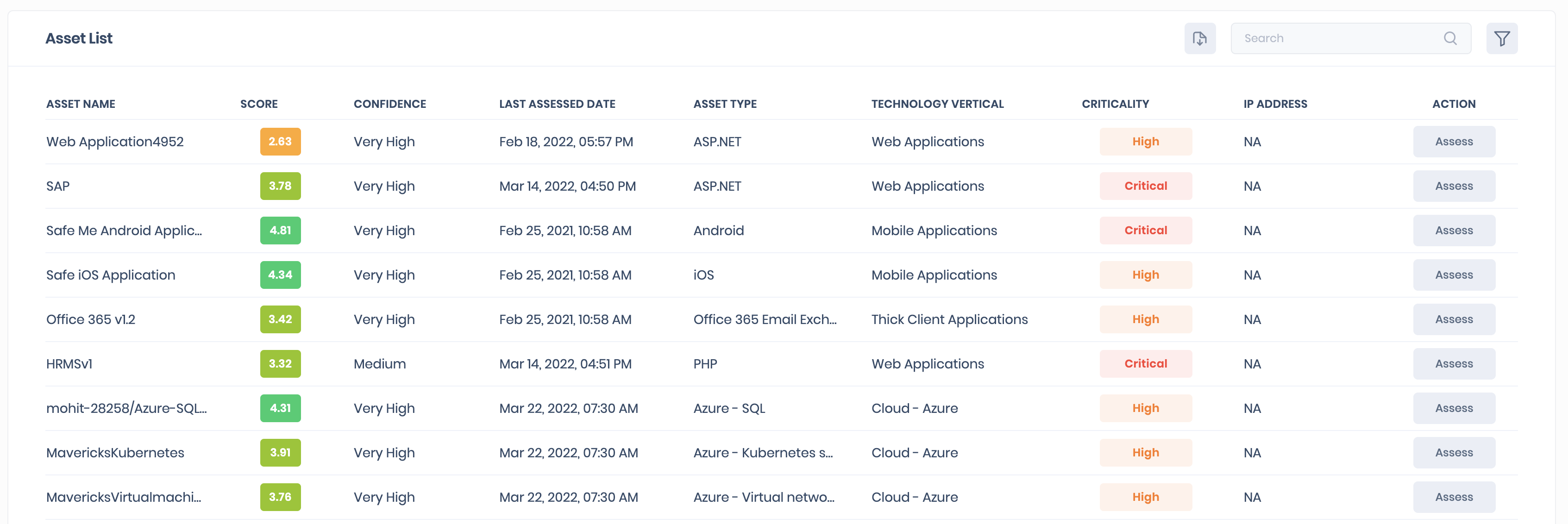
Detailed table of all assets within selected groups showing hostname, IP, OS, location, and owner. Supports sorting, filtering, and customizable column selection for different views.
Assets by Site
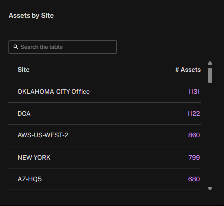
Two-column summary showing asset counts grouped by physical location or logical site. Helps understand infrastructure distribution and identify concentration risks.
Assets by Owner
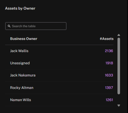
Lists all asset owners and their respective asset counts within selected groups. Facilitates ownership tracking and responsibility assignment across the organization.
Asset Coverage
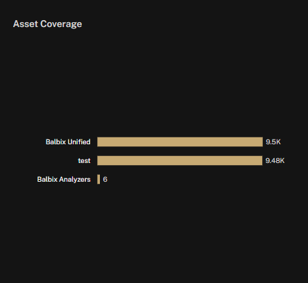
Horizontal bar chart showing percentage of assets monitored by each security tool. Identifies gaps in security tool deployment and monitoring blind spots.
Software Inventory
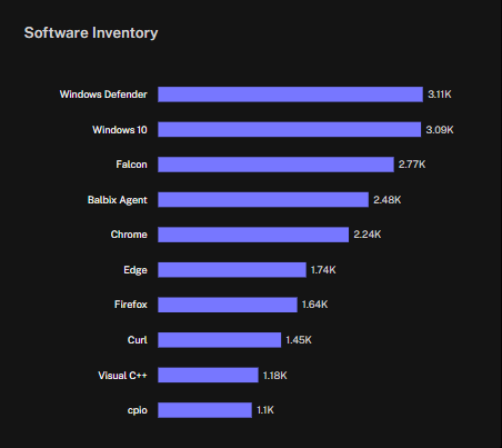
Catalogs all discovered software across the environment with version information. Tracks installed applications, identifies unauthorized software, and monitors version compliance.
Data Source Telemetry
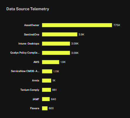
Monitors health and data quality from connected security tools and scanners. Shows last sync time, data freshness, and any connection issues requiring attention.
Coverage Summary
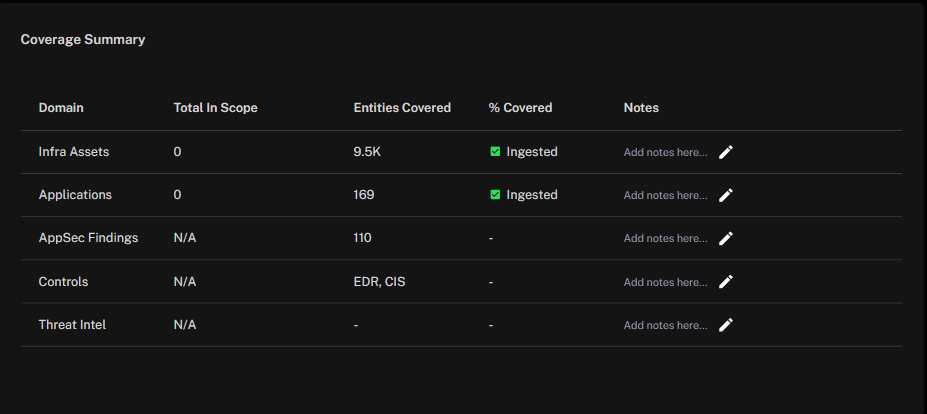
High-level overview of overall monitoring coverage across the environment. Aggregates coverage metrics to show percentage of assets with complete security visibility.
Asset Types
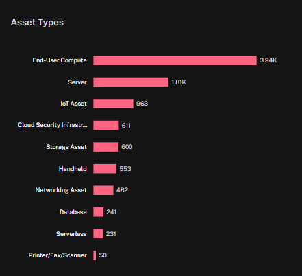
Categorizes assets by type (servers, workstations, network devices, IoT). Provides visibility into infrastructure composition and helps identify device-specific risks.
Power Widgets
Bar Chart
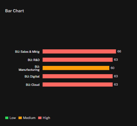
Flexible bar chart comparing any metric across up to 10 asset groups. Supports horizontal/vertical orientation and multiple visualization options.
Trend Chart
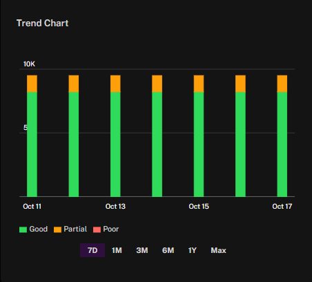
Time-series visualization tracking metric changes over customizable periods. Shows historical patterns, trends, and anomalies for selected measurements.
Donut Chart
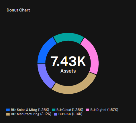
Circular chart displaying proportional relationships between categories. Ideal for showing distribution of assets, vulnerabilities, or risk across segments.
Histogram
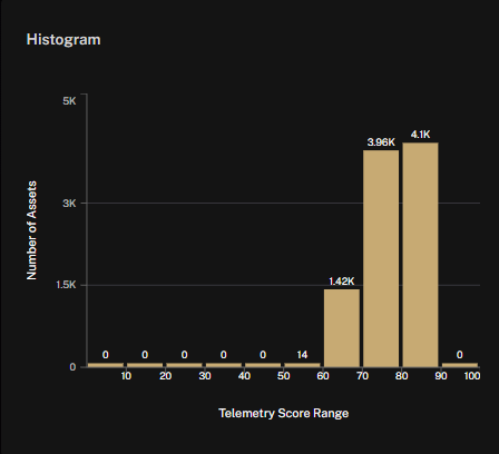
Distribution chart showing how assets fall across score ranges. Visualizes concentration of risk scores, telemetry scores, or criticality ratings.
Dashboard Notes
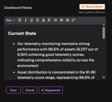
Rich text widget for adding context, instructions, or executive summaries. Supports formatted text, links, and embedded content for documentation.
APPLICATIONS
Exposure Management (EM)
Findings List
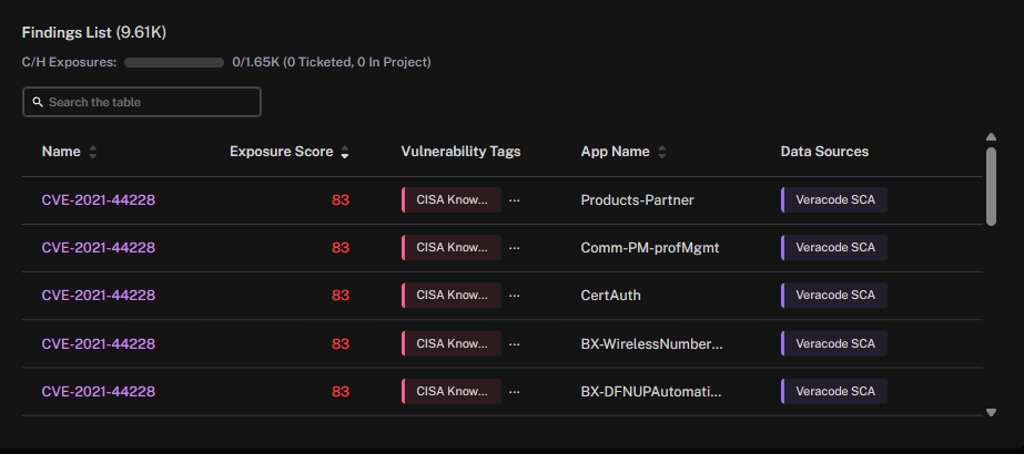
Detailed table of security findings from application scanning and testing. Shows vulnerability type, severity, affected components, and remediation status.
Findings Summary
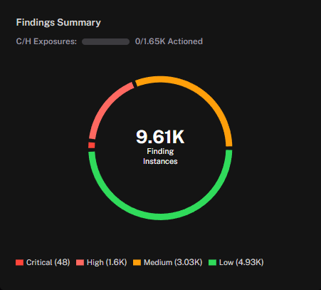
Visual overview of application security findings grouped by severity level. Displays total finding counts with critical, high, medium, and low severity breakdown.
Findings Count Comparison
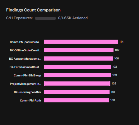
Compares security finding counts across applications or time periods. Tracks whether application security posture is improving or degrading.
SLA Compliance: Apps
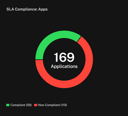
Monitors whether application patching meets defined service level agreements. Shows percentage of applications patched within required timeframes versus overdue.
SLA Compliance: App Findings
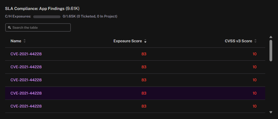
Tracks application security finding remediation performance against SLA targets. Displays on-time remediation rates and identifies applications with persistent SLA violations.
Exposure Assessment (EA)
Application List
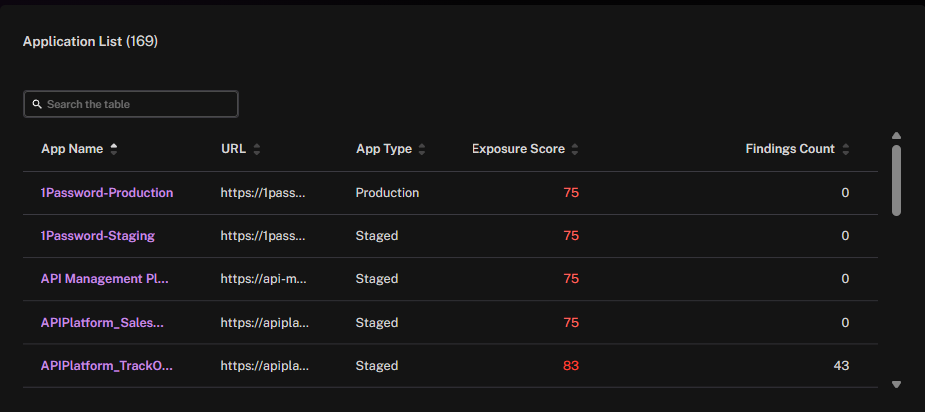
Inventory of all applications within selected groups with metadata. Shows application name, criticality, owner, technology stack, and compliance status.
Power Widgets
Bar Chart
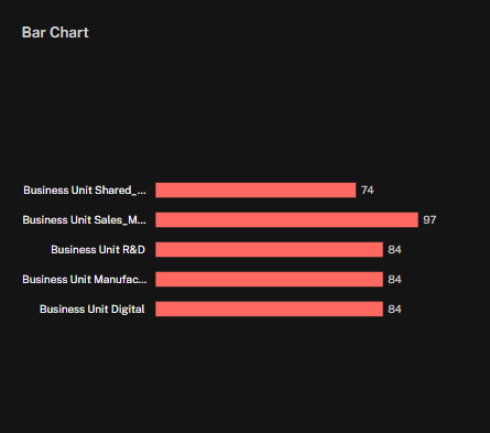
Compares application metrics across multiple apps using bar visualization. Flexible metric selection for finding counts, risk scores, or coverage percentages.
Trend Chart
.png)
Tracks application security metrics over time with trend analysis. Shows improvement or degradation in application security posture.
Donut Chart
.png)
Proportional view of applications grouped by selected attributes. Useful for showing distribution by risk level, technology, or finding severity.
Histogram
.png)
Shows how applications are distributed across risk or security score ranges. Identifies clusters of high-risk applications requiring focus.
Dashboard Notes
.png)
Rich text widget for adding context, instructions, or executive summaries. Supports formatted text, links, and embedded content for documentation.
See Also: