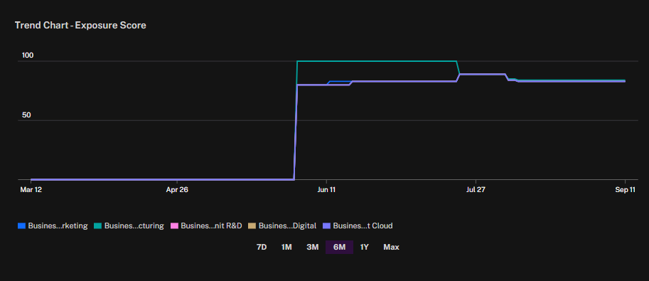
The Trend Chart – Exposure Score widget shows how exposure scores evolve over time across business units. Each line on the chart represents a different business unit, with the Y-axis indicating exposure score (0–100) and the X-axis showing the selected time period.
Lines track the progression of exposure scores for each business unit.
Time Controls allow you to adjust the view to 7 days, 1 month, 3 months, 6 months, 1 year, or the maximum available range.
Score Changes appear as upward or downward movements, highlighting shifts in risk posture over time.
This widget helps teams monitor how exposure is trending across organizational units, detect sudden increases or decreases, and assess whether remediation efforts or new issues are driving changes in risk levels.
You can also configure this widget to display the number of apps instead of the exposure score.
See Also: