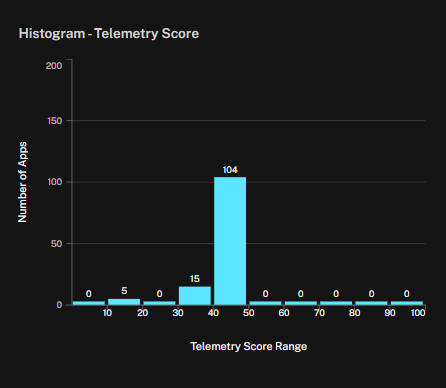
The Histogram widget shows the distribution of applications across telemetry score ranges. The X-axis represents score ranges (0–100), while the Y-axis represents the number of applications that fall into each range.
This widget helps teams evaluate the overall distribution of telemetry coverage, identify whether applications are concentrated in low, medium, or higher ranges, and detect gaps where few or no applications meet stronger telemetry standards.
You can also configure this widget to display exposure scores.
See Also: