You can find these options in the EM Analytics menu.
These Exposure Management Analytics widgets offer a clear, data-driven look at the vulnerabilities and risks present in your environment. They provide snapshots of newly introduced threats, the total volume of unresolved issues, and which assets or software are most exposed. Instead of relying on vague alerts or lengthy spreadsheets, each widget distills essential information into a visual format that’s easier to interpret and act upon.
By focusing on different dimensions, these widgets help security teams identify precisely where their environment is most at risk. You can quickly see if a specific vulnerability is widespread or if a smaller number of critical flaws could have a more severe impact. This level of detail ensures that the right remediation actions can be taken with minimal delay.
Many of these widgets highlight SLA breaches, providing a practical way to track whether patching and remediation efforts are meeting internal or regulatory deadlines. Others show how newly discovered issues are being fixed relative to how quickly they appear. Taken together, the widgets create a living dashboard that updates regularly, giving you immediate insight into changes in your security posture.
As you explore each widget, you’ll notice they’re designed to guide your decision-making rather than merely supply data. The goal is to pinpoint critical exposures, reveal patterns in how vulnerabilities spread, and track whether your mitigation strategies are having the intended effect. By using the widgets collectively, you can maintain a comprehensive view of your organization’s security risks and continuously refine your approach to managing them.
Widget | Description |
|---|---|
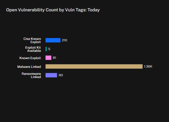
| Open Vulnerability by Vuln Tags: TodayThis widget focuses on showing unique vulnerabilities that have specific threat tags, providing a snapshot of how many distinct issues in your environment carry those critical labels within the last day. Each bar corresponds to a particular tag, such as “CISA Known Exploit” or “Malware Linked,” and the count represents the total number of unique vulnerabilities associated with that tag. In this view you can see unique vulnerabilities; each vulnerability is only counted once, regardless of how many devices or systems it might affect. This gives you a quick sense of which threat tags are most prevalent in your environment and helps you prioritize remediation efforts accordingly. Behind the scenes, Balbix is continuously collecting data from various sources, including vulnerability scanners, threat intelligence feeds, and endpoint monitoring tools. When a new or existing vulnerability is detected, Balbix classifies it according to whether it matches known exploit patterns, malware signatures, ransomware campaigns, or other indicators of compromise. These classifications are important for risk assessment because they highlight the vulnerabilities that have proven, real-world exploits, making them more urgent to address. The widget is designed to surface this categorization at a glance, so you can see which vulnerabilities demand immediate attention. When interpreting the chart, focus on which threat tags have the highest counts. If “Malware Linked” is dominating, for instance, that suggests attackers have a pathway to compromise your systems via known malware exploits, and you may need to accelerate patching or mitigation strategies for those vulnerabilities. On the other hand, if you see a spike in “CISA Known Exploit,” it means there are high-profile vulnerabilities recognized by government agencies as actively exploited in the wild. Paying attention to the relative sizes of each category helps you understand where to direct your resources and how to shape your security policies. Because the data reflects only the last day, the widget gives you a timely view of how your vulnerability landscape is evolving. If you notice a sudden increase in one of the tags, it might indicate a new campaign or a newly disclosed exploit. This daily refresh can be critical for maintaining situational awareness and ensuring your security team is prepared to respond to the latest threats. The widget thus serves as both an early warning system and a guide for continuous risk reduction, enabling you to keep pace with the ever-changing threat environment. |
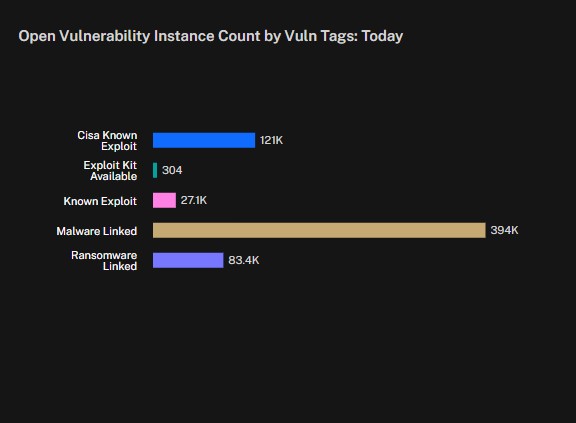
| Open Vulnerability Instance Count by Vuln Tags: TodayThis widget serves the same purpose as the previous one in categorizing vulnerabilities by threat tags—like “CISA Known Exploit” or “Ransomware Linked”—but it counts every occurrence across your environment, not just the unique vulnerabilities. Instead of telling you how many distinct vulnerabilities exist, it tells you how many total instances of those vulnerabilities are present on all of your systems. This view can be crucial for understanding the breadth of each threat category across your entire asset inventory. Operationally, this distinction between unique vulnerabilities and total instances matters a lot for resource allocation. Knowing you have a single vulnerability type is one thing, but realizing that it’s spread across hundreds or thousands of systems immediately changes your remediation strategy. You might allocate more patching resources or implement mitigations on the most critical systems first. By focusing on how many instances of a vulnerability are out there, security teams can more accurately assess overall risk and plan their response to ensure the largest reduction in attack surface in the shortest possible time. |
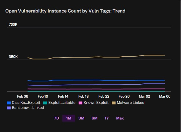
| Open Vulnerability Instance Count by Vuln Tags: TrendThis widget tracks vulnerabilities over time, organized by threat tags, and counts how many total instances exist in your environment for each tag. Because it focuses on “instances,” it shows how widespread each vulnerability category is, rather than just whether it exists. You’ll see multiple lines corresponding to categories like “CISA Known Exploit” or “Malware Linked,” each one charting the total occurrences of that category across your assets for each day. Its primary purpose is to help you spot trends. If the line for a particular threat tag suddenly spikes, that suggests a rapid proliferation of that vulnerability across your systems. Conversely, if a line drops sharply, it could mean your recent patching efforts or mitigations have taken effect. By observing these movements over days, weeks, or even months, you can confirm whether your remediation strategies are making a tangible difference. Because the widget displays historical data, it also helps you understand how vulnerabilities evolve in your environment. A slow and steady rise might point to unpatched systems gradually becoming outdated, while a sudden jump might indicate a newly disclosed exploit that’s spreading quickly. Seeing these shifts in real time allows you to align resources and focus on the most pressing threat categories before they become unmanageable. In an operational context, this time-based view is invaluable for scheduling patch cycles, planning downtime, and allocating manpower. Instead of reacting blindly, you can prioritize vulnerabilities that show clear upward trends in instances, ensuring you tackle the most immediate risks first. Over time, the widget’s lines give you a performance metric for how well your organization is keeping pace with emerging threats and whether your security posture is strengthening or weakening. |
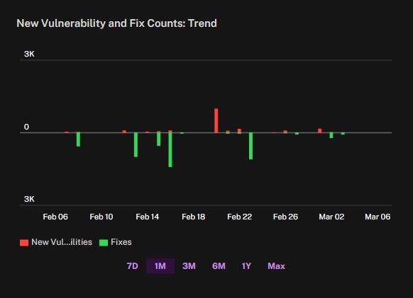
| New Vulnerabilities and Fix Counts: TrendThis widget provides a time-based comparison of how many new, unique vulnerabilities appear in your environment versus how many are fixed. Red bars indicate the emergence of new vulnerabilities, while green bars show how many were remediated on a given date. By tracking these changes, you can gauge whether you’re closing the gap between discovered vulnerabilities and fixed ones. If the red bars outpace the green for several days in a row, it suggests new issues are being introduced faster than you can remediate them. On the other hand, if the green bars exceed the red, you’re actively reducing your overall risk. This perspective is especially helpful for measuring the effectiveness of your security program. You can observe how quickly your teams respond when new vulnerabilities appear, and whether your remediation strategies are keeping pace. When you see a big red spike, it might be triggered by a newly published advisory that affects multiple components in your environment; a subsequent green spike would indicate your response efforts, reflecting the patches or mitigations you’ve applied. Operationally, this data informs your patch scheduling and resource planning. If you notice a persistent trend of high new vulnerabilities, you may need to adjust your patch management processes or expand your remediation team’s capacity. Conversely, if you consistently fix most of the vulnerabilities that you discover, you’re likely maintaining a strong defensive posture. Over time, the widget’s daily snapshots help you track progress and ensure your organization remains on top of emerging threats. |
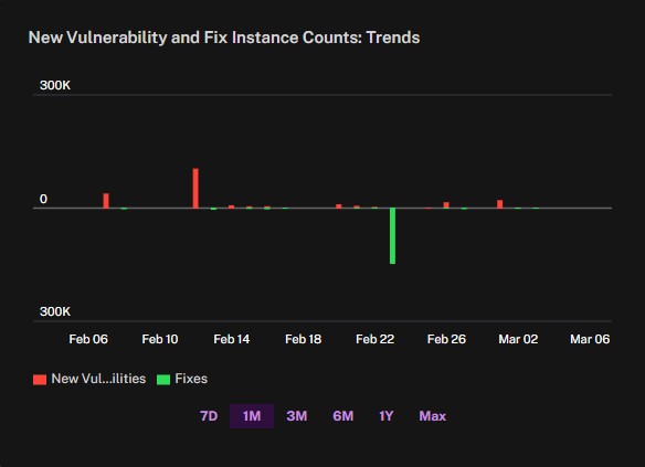
| New Vulnerability and Fix Instance Counts: TrendsThis widget measures how many new and fixed vulnerabilities appear across all affected systems, not just whether a particular vulnerability exists. A single vulnerability can appear thousands of times if it impacts many endpoints, so when new issues emerge, the red bars can show much larger spikes. That makes it clear whether a single exploit is proliferating widely in your environment. Because it tallies each instance, you get a clearer sense of the overall workload facing your remediation teams. A vulnerability that shows up on a large fraction of your endpoints will drive a big red bar, potentially overshadowing smaller but more numerous unique vulnerabilities. Meanwhile, a green bar indicates the total number of remediated instances. If it lags behind the red bar, it suggests your fixes haven’t caught up with new occurrences. This perspective matters for prioritizing patching and resource allocation. If a vulnerability is limited to a small number of systems, the total instances might not rise dramatically. But when you see a major surge in new vulnerabilities, it means your environment could be exposed on multiple fronts. The widget helps you spot these sudden influxes of risk so you can focus your efforts accordingly. By watching how the red and green bars evolve, you also gain a sense of how well your team is keeping pace. You might find that although you’re patching diligently, you still struggle to reduce the overall number of instances if they spread quickly. This daily snapshot encourages you to refine your processes—whether that means faster patch deployment, improved configuration management, or better visibility into your endpoints. |
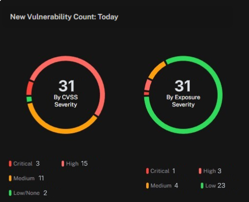
| New Vulnerability CountThis widget provides an immediate snapshot of newly discovered or introduced vulnerabilities in your environment. It breaks them down into two categories—By CVSS Severity and By Exposure Severity—so you can see both the standardized risk rating and a context-based assessment specific to your organization’s exposure. This real-time perspective helps you understand exactly how many fresh issues have cropped up since the last update, making it easier to prioritize your security response. The widget is designed for rapid awareness rather than long-term trend analysis. If the numbers spike unexpectedly, it’s a signal that something significant has changed—maybe a newly disclosed vulnerability is affecting multiple systems, or a major software update introduced fresh risk. Seeing that jump right away allows you to react before the issues accumulate over time. |
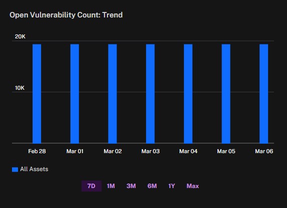
| Open Vulnerability Count: TrendThis widget tracks the total number of unique, unresolved vulnerabilities across your environment. Each vulnerability is counted once, even if it appears on multiple systems. This gives you a high-level snapshot of how many distinct security gaps remain open, without inflating the numbers based on multiple occurrences of the same flaw. It’s a straightforward way to keep an eye on overall exposure and see whether your security posture is improving or worsening over time. The widget lets you view this data over different time spans—such as a week, a month, or even longer—so you can identify larger trends rather than focusing on just one narrow slice of time. If the number of open vulnerabilities steadily decreases, that may indicate successful patching and remediation efforts. On the other hand, if it stays the same or grows, it might suggest that newly discovered issues are outpacing your team’s ability to fix them. Beyond simply displaying the current count, the widget also helps you evaluate whether you’re managing vulnerabilities effectively in relation to your patch cycles. If you notice that a particular period saw a spike, it could be due to a wave of newly published exploits or a delay in rolling out updates. Being able to jump between different time windows means you can correlate changes in your open vulnerabilities with events like major software releases or security advisories. |
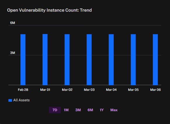
| Open Vulnerability Instance Count: TrendThis widget tallies every occurrence of a vulnerability across all your systems. In operational terms, having a high number of vulnerable instances can prompt more aggressive response strategies. If a newly discovered vulnerability appears on a significant portion of your critical servers, you’ll know you need to allocate resources immediately to minimize risk. Even if the vulnerability itself isn’t uniquely severe, the sheer volume of affected endpoints could elevate it to a higher priority. |
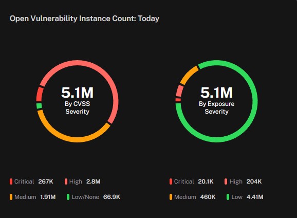
| Open Vulnerability Instance Count: TodayThis widget provides a real-time tally of all currently unresolved vulnerabilities in your environment, broken down into two categories—one by CVSS Severity, and the other by Exposure Severity. Each category is shown as a circular visualization, with slices representing critical, high, medium, and lower-priority issues. This format helps you quickly gauge both the overall volume of vulnerabilities and how serious they are according to different risk models. Focusing on today’s snapshot means you can instantly see how many issues are live at any given moment. If the widget shows a surge in critical or high-severity vulnerabilities, you know it’s time to prioritize those patches or mitigations. The difference between CVSS Severity and Exposure Severity often reveals whether a vulnerability is dangerous in general, or specifically poses a risk based on your organization’s unique asset configuration and threat exposure. By comparing the two circles, you can decide how to balance your efforts. A vulnerability that ranks high in CVSS might be less threatening in your particular environment if it’s on low-value systems or partially mitigated by existing controls. Conversely, a seemingly moderate CVSS issue could be flagged as high in Exposure Severity if it’s found on crucial servers or lacks compensating controls. Having both views side by side allows you to make more nuanced decisions about where to focus resources. Operationally, this widget gives security teams a clear sense of whether newly discovered vulnerabilities are overshadowing ongoing remediation efforts. If the numbers remain stubbornly high in one category, it may be time to adjust patch management workflows or deploy additional safeguards. |
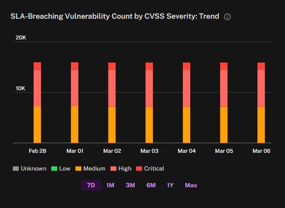
| SLA-Breaching Vulnerability Count by CVSS Severity: TrendThis widget shows how many unique vulnerabilities in your environment have surpassed their designated remediation deadlines, based on severity level. Each vulnerability is counted once, regardless of how many systems it affects. By stacking the bars with color-coded segments (Critical, High, Medium, Low, and Unknown), you can quickly see which severities are most often in breach of their service-level agreements (SLAs). Each severity has a different timeframe for remediation. Critical vulnerabilities are considered in breach if not remediated within 30 days, High within 60 days, and Medium within 90 days. The bars are displayed over various time ranges, so you can track trends and see whether your team is improving or falling behind on remediation targets. A persistent rise in Critical or High breaches might mean your patching processes or resource allocations need re-examination. On the other hand, a steady decline in breaches indicates you’re meeting your SLAs more effectively and keeping pace with the vulnerabilities being discovered. From an operational standpoint, this widget helps you focus your remediation efforts where they’re needed most urgently. If you see a spike in the Critical category, that’s a clear sign you should prioritize those vulnerabilities immediately. Monitoring the breaches in real time also encourages a more proactive approach, ensuring that deadlines are not continually pushed back and that your team addresses the most severe gaps first. |
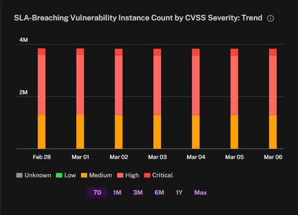
| SLA-Breaching Vulnerability Instance Count by CVSS Severity: TrendThis widget tracks every occurrence of a vulnerability that has exceeded its remediation deadline, rather than just unique vulnerabilities. Each severity has a different timeframe for remediation. Critical vulnerabilities are considered in breach if not remediated within 30 days, High within 60 days, and Medium within 90 days. By showing how many total instances of each severity remain open past their deadlines, the widget highlights the full scale of overdue patches. Because this view tallies every occurrence of a vulnerability, a single unpatched flaw that affects hundreds or thousands of endpoints can dramatically increase the bar for that particular severity. This provides a clearer picture of the actual workload your team faces. If you see a large spike in Critical or High instances, it means those vulnerabilities are not just severe in nature, but also widespread across your environment. Having the data broken down by severity helps you decide where to focus first. Even if a Critical vulnerability is the same one appearing on multiple systems, each instance could pose a potential point of compromise. A spike in Medium or Low severities may be less urgent but can still represent a significant cumulative risk if left unattended. From an operational perspective, monitoring overdue vulnerabilities at the instance level ensures you understand the magnitude of each breach. It can also guide more efficient patch management: addressing the most common vulnerabilities first often yields a rapid reduction in the overall number of overdue instances, helping you catch up on SLA commitments more effectively. |
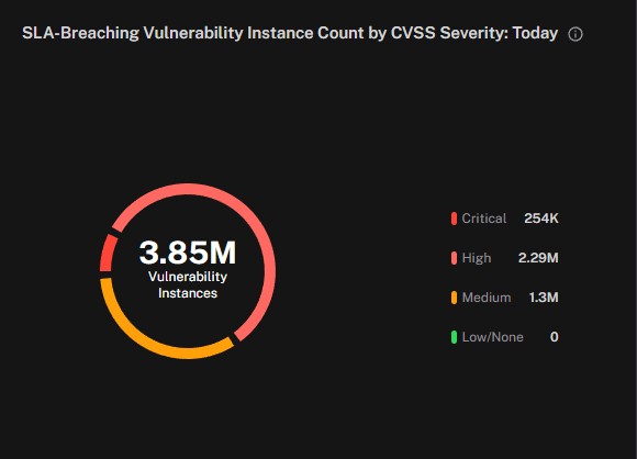
| SLA-Breaching Vulnerability Instance Count by CVSS Severity: TodayThis widget shows a real-time snapshot of vulnerabilities that have exceeded their remediation deadlines, categorized by severity level. Instead of charting them over a range of dates, it focuses on how many overdue vulnerabilities exist at this moment, highlighting which severities are driving the most urgent risk. Each severity has a different timeframe for remediation. Critical vulnerabilities are considered in breach if not remediated within 30 days, High within 60 days, and Medium within 90 days. When any of these windows is exceeded, the vulnerability is flagged as an SLA breach. Seeing the total count for each severity type in one place helps you quickly identify where the biggest gaps are. Because the widget displays the data “today,” it helps you prioritize immediate action. If there’s a surge in Critical breaches, you know to address those vulnerabilities first. Meanwhile, a large number of High or Medium breaches may indicate systemic patching delays or process inefficiencies that need more attention over time. |
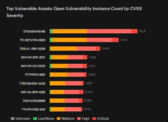
| Top Vulnerable Assets: Open Vulnerability Instance Count by CVSS SeverityThis widget highlights which assets in your environment have the highest number of vulnerability instances, and it breaks those instances down by CVSS severity. Because it focuses on instances, the bars for each asset reflect every occurrence of each vulnerability on that system, offering a more complete sense of how widespread the risk is. It’s especially useful for identifying assets that might be hosting multiple vulnerabilities, any of which could serve as an entry point for attackers. The color-coded segments in each bar represent different severity levels—such as Critical, High, Medium, Low, or Unknown—allowing you to quickly spot whether a given asset is suffering from a large number of lower-severity issues or a smaller number of high-severity ones. By showing this distribution at the asset level, you can make informed decisions about where to deploy resources first. An asset with fewer total vulnerabilities but many of them rated Critical might be more dangerous than an asset with a large number of Medium or Low severity issues. From an operational standpoint, this widget makes it easier to see which systems could cause the most damage if exploited. The list format, with each asset’s name on the left and the bar on the right, also lets you focus on critical infrastructure. For instance, if you spot a production server or a database with a large red segment, it’s a clear sign you need to prioritize patching or other mitigation strategies there. Tracking these high-risk assets over time can help you gauge the effectiveness of your remediation efforts. If the same names keep appearing at the top of the list, it may be time to review whether these systems need special handling, such as more frequent patching cycles or additional protective controls. By continuously monitoring which assets have the most vulnerability instances, you can tailor your security approach to stay ahead of potential threats. |
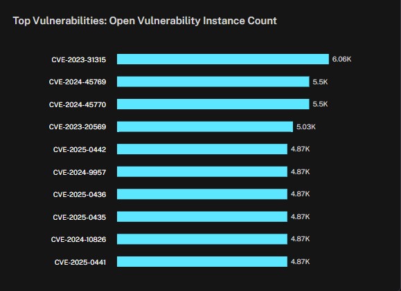
| Top Vulnerabilities: Open Vulnerability Instance CountThis widget shows which vulnerabilities are most widespread across your environment, listed by their CVE ID. Each bar indicates the total number of affected systems or endpoints, giving you a quick sense of how frequently each vulnerability appears. Because it focuses on instances, a single CVE that exists on thousands of machines will have a significantly higher count than a vulnerability that appears only a few times. By presenting the vulnerabilities in descending order of their total instances, the widget helps you see which issues pose the biggest coverage risk. Even if a vulnerability is not the most severe, it can still be a high priority if it affects a large number of critical assets. This perspective ensures you’re not just looking at whether a vulnerability exists, but how extensively it’s actually deployed across your infrastructure. Having these counts at your fingertips also makes it easier to plan your remediation efforts. If the top vulnerability on the list has a particularly high count, that might be where you can get the most immediate reduction in overall risk by applying a patch or mitigation strategy. Meanwhile, the presence of multiple vulnerabilities with similarly high counts may point to systemic patching or configuration issues that need more attention. |
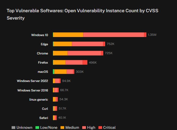
| Top Vulnerable Softwares: Open Vulnerability Instance Count by CVSS SeverityThis widget highlights which software products in your environment contain the largest number of vulnerability instances, broken down by severity. Each bar represents how many instances of a given software’s vulnerabilities exist, and the color-coded segments show their severity levels. This perspective helps you quickly identify which products or platforms pose the most significant coverage risk. Because it focuses on instances, a single vulnerability within a popular software might inflate the numbers if that software is installed across many devices. Even if the vulnerabilities are individually less critical, the widespread usage can make them a higher priority for remediation. Conversely, a smaller number of vulnerabilities with high severity might also demand urgent attention if they appear on business-critical software. Seeing the distribution of severities within each software category gives you a better idea of how dangerous those vulnerabilities are. An application with a high count of critical or high-severity flaws is likely more urgent to patch than one where most issues are medium or low severity. This breakdown ensures you’re balancing both the breadth of exposure and the potential impact of each vulnerability. Operationally, this widget guides you to address the software platforms that represent the biggest overall risk. If a particular application frequently tops this list, it might require more frequent patch cycles or closer monitoring. Over time, tracking how these bars evolve can reveal whether your efforts to patch or upgrade specific software are effectively reducing the number of vulnerabilities that remain unaddressed. |
See Also: