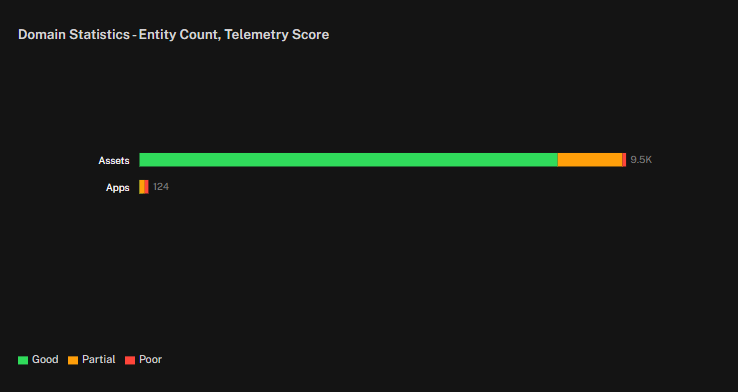
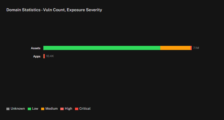
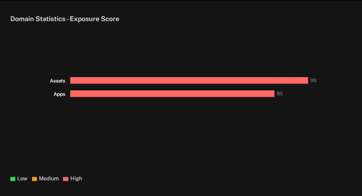
The Domain Statistics widget provides a visual summary of entity risk distribution across major domains such as assets and applications. Each domain is represented as a stacked bar (or optionally a donut), with segments color-coded by severity level.
Alongside the visualization, the total count of entities in each domain is displayed. The color segments highlight how entities are distributed across severity categories, helping teams quickly assess concentrations of risk.
You can configure the widget to tailor the view to your analysis needs:
Metric: choose to display by Entity Count, Vulnerability Count, or Exposure Score.
Show As: toggle between Bar or Donut visualization styles.
Break Down by: group results by Telemetry Score or Exposure Severity to adjust the perspective of the risk distribution.
This flexibility makes the Domain Statistics widget useful for both high-level summaries and detailed investigations into how risk is distributed across your environment.
See Also: